Digital accessibility is indispensable for people with disabilities to be able to perform their basic tasks online in an independent manner. People with disabilities, English-language learners, and those with limited technology skills may have trouble viewing or reading the digital communications provided for your company’s managed travel program. Overlooked accessibility concerns can lead to lower traveler engagement within your program. Fortunately, there are tools available to help overcome these challenges, but it’s up to travel program stakeholders to create a foundation for success.
Here are five considerations for producing digitally accessible corporate travel communications.
1. Go “behind the screens” with alternative text.
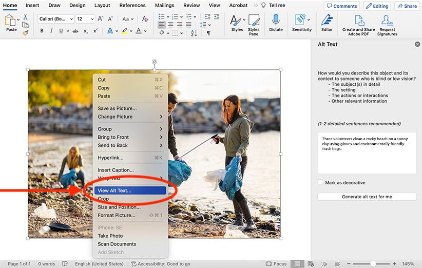
Alternative (alt) text is a basic principle of accessible design. It’s useful for assisting and supporting users who are sight-impaired or otherwise unable to visually identify images. Alt text is an “invisible” description of images. That means it’s added “behind” images so assistive technologies can detect it and read it aloud. Alt text should be simple and concise, describing the image as accurately as possible. Descriptions should be no longer than 100 characters; longer text may result in a poor experience for users.
Including alt text with your images ensures all users, regardless of visual ability, can access the content on your site and in your documents.

2. Create information in audio and visual formats.
Providing information in multiple formats helps ensure that everyone can use it. Some users may opt for text-based communications, while others may favor audio or visual content. For example: to teach travelers how to book travel online, you could provide written instructions, an audio recording, and a video tutorial.
3. Use the right color and contrast for easier viewing.
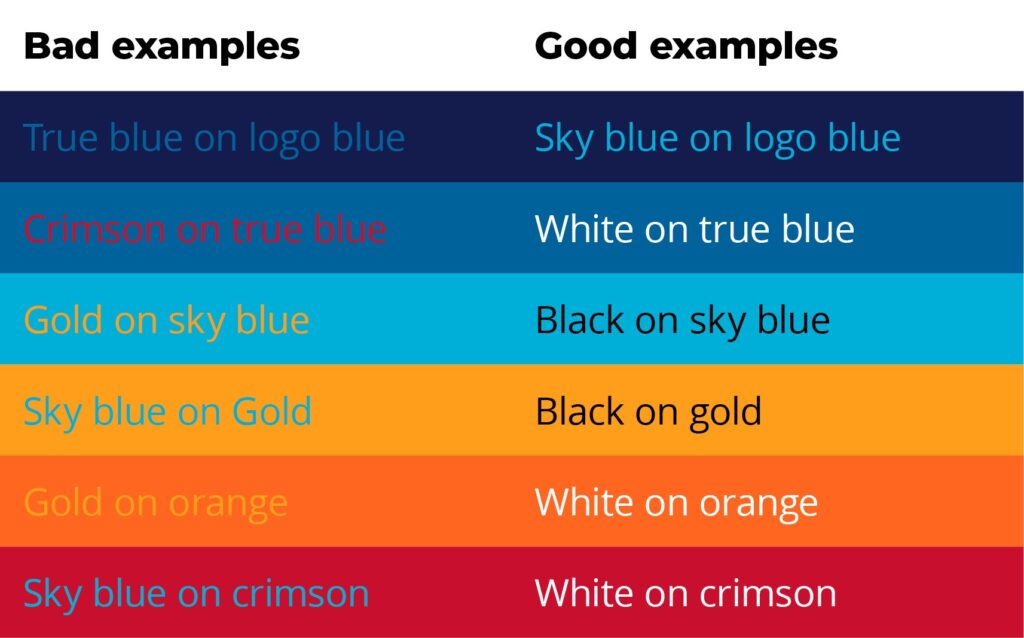
Proper color contrast is necessary for visual users to read and/or understand the words and pictures on a page. Colors affect how people interact with the content written in those colors. Red and green might make for great party colors – but it’s no good for reading on screen. Shades of grey are popular for text – but black is a better choice. In general, low-contrast colors, e.g., blue on black, red on green, or green on orange, are difficult to read. High-contrast colors are easier – think black on white, black on green, or white on purple. Proper contrast ensures content is viewable on any device.
Tip: Search contrast checkers online to check accessibility against the standards set by the W3C® Web Accessibility Initiative in the Web Content Accessibility Guidelines.

4. Add captions to videos.
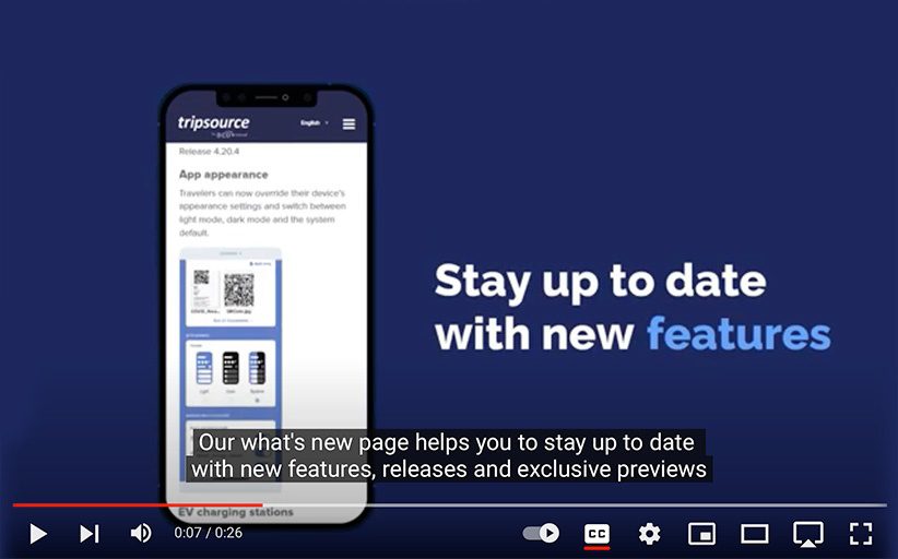
While video content can be a great way to provide instructions or tutorials, some travelers may be using devices without speakers or may have a hearing impairment that prevents them from accessing the audio. Captions provide added support for deaf or hard-of hearing users. Today, most video editing software can automatically generate captions, making it easy to create accessible video content.

5. Test accessibility and keep making improvements.
Before sending internal travel communications, test them for accessibility. Provide as many of the above considerations as possible.
While there are a lot of factors that come together to create an equitable travel program, it’s important to make a commitment to start somewhere. Begin with the materials you already have and assess them through an accessibility lens. Identify gaps and opportunities and build new materials that follow the guidelines.


